Venmo’s engineers and designers are constantly tweaking and upgrading the Venmo app. They are always working on new designs and new features to make paying friends more enjoyable, intuitive, and engaging. As our user base grows, so does the amount and variety of data we have access to, which we can use to inform how we improve the product.
We recently started using Looker at Venmo, and this has made it much easier for PMs, engineers, and designers to leverage this data and make informed product decisions.
The engineering team’s first use of Looker occurred during a recent app release and design change.
Up until recently, the compose screen on the Venmo iOS app had the design seen below. A user would enter her friend’s name, payment amount, and payment description, and then would select whether she wanted to pay or charge.
Once the user selected pay or charge, a "Send Payment" or "Send Charge" confirmation button was presented. This binary option forced a user to choose and confirm their action.
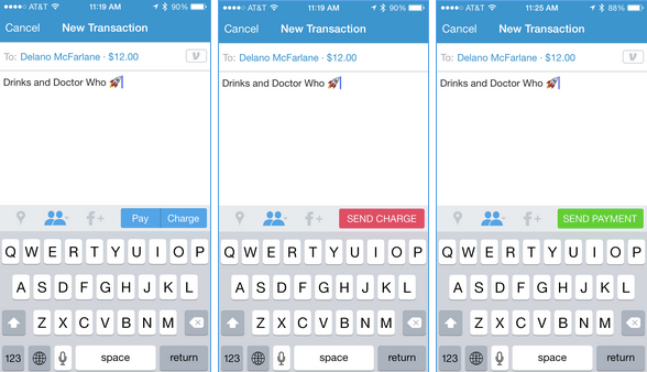
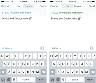
On June 4, 2014, Venmo released iOS version 6.0. In this release, the design and product team decided to eliminate the binary option, and each Venmo transaction defaulted to pay. Before hitting send, the user could toggle back and forth at the top of the screen to choose between pay or charge.
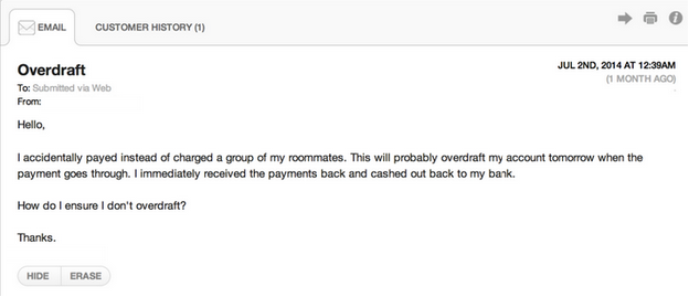
Venmo’s support team closely monitors cases from our users to see the types of issues they are having. When the support team notices an influx in a certain category of case, or a new, unique problem that starts to arise, they reach out to the Venmo product team to investigate.
In the case of the updated iOS release, v6.0, the support team saw a sudden influx in users writing in, asking to reverse their payments because they had accidentally paid when they meant to charge.
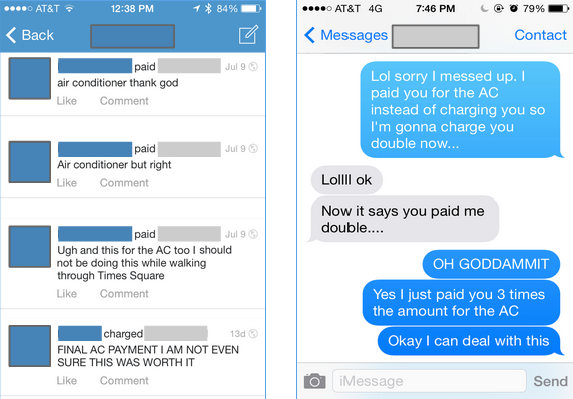
In the Venmo feed, we were also seeing that users were paying their friends, then realizing their mistakes and charging their friends for double the initial amount. This person actually made the mistake three times in a row…
The support team notified the product team to investigate the problem. It was clear some users were accidentally paying instead of charging, but it wasn’t clear how widespread the problem was and whether it was worth prioritizing a fix.
The product team then reached out to the data team, to do deeper analysis into the problem and see how many users were actually making the mistake. Initially, the data team did not use Looker; whenever we were asked for data, we would write a custom script, print out a bunch of data to excel, do a bunch of manual calculations, and then repeat this process whenever the product team wanted to extend the timeframe.
 The data team decided to build this analysis using Looker, our new business intelligence tool. Looker’s browser-based platform makes it easy for us to discover what’s going on in our business and how people are using our product. So using Looker, we created a table with custom dimensions and measures to identify these payments with just one boolean flag. We tracked these errors in payments by flagging users that make a payment and then charge the same user two times the original amount, within two days of the initial payment (a common behavior we noticed for users who made the pay/charge mistake).

We first looked at the percentage of charges that are mixups across payment mediums (iOS, Android, and web). We found that when version 6.0 was released, the percentage of mistaken charges on iOS increased from less than .5% to over 6%, which suggested that the iOS v6.0 release was somehow to blame.

x-axis shows the day the charge was made, y-axis shows #of charge mistakes/# of charges made on that day
So, we dug a little deeper and looked at the different app versions used in charge mixups, pre version 6.0 vs. version 6.0. Users that didn’t upgrade to version 6.0 stayed constant; however, users that upgraded saw a surge in charge mixups.

After reviewing the data with the engineering and design teams, we knew that version 6.0 was causing the problem and that we had to implement a solution. On July 21, 2014, the product team released version 6.2 for iOS, reintroducing the binary payment option, with the pay and request buttons at the bottom of the payment screen.
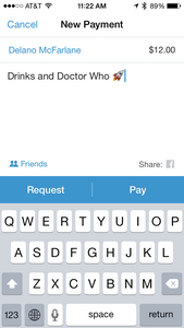
Since releasing version 6.2, we have been monitoring the pay/charge mixups across app versions; pre version 6, version 6.0 - 6.1, and version 6.2. While mistakes are not back to the pre-version 6.0 numbers, updating the pay/charge buttons decreased errors by more than half.
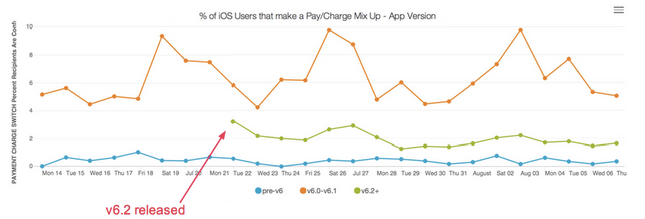
As of August 8th, 43% of iOS users had upgraded to v6.2, and our support team has continued to see a decrease in payment/charge confusion cases as the new version’s adoption increases.
Looker made this analysis much easier for the data, product, and engineering teams. Once the product and engineering teams sent the original data request, everything they needed was easily accessible in their customized Looker dashboard, giving them all the data they needed right at their fingertips.
We’re super excited to continue using Looker to help us make data-driven product decisions at Venmo!
